English Chinese Typography: How to Pair Fonts for a Bilingual Brand
Branding
7
min read
Published
(Last Edited:
)
Most Hong Kong businesses show their name, website and printed material in both English and Chinese. Often the English font is chosen with care, and the Chinese text is set later in whatever font the computer offers. The result looks like two different companies sharing one business card.
This guide is for owners and marketing leads who want both languages to look like one brand. You will learn why the two scripts behave differently, how to choose a Chinese font that matches your English one, and what to check before you approve a logo, a website or a print run.
You do not need a design background. Each rule below is something you can test yourself on a phone screen or a printed proof.
Why English and Chinese text look different side by side
English letters and Chinese characters are built in different ways, so a pairing that looks right on paper can still feel unbalanced.
Shape. Each Chinese character fills a square of the same size. English letters vary in width and sit on a line, with short letters (a, e, o) and tall ones (b, h, k).
Density. A single character such as 鑼 has many strokes in the same space where English has one simple letter. At the same font size, Chinese usually looks larger and darker.
Spacing. Chinese has no spaces between words, and lines can break after almost any character. English breaks only between words.
Punctuation. Chinese uses full-width punctuation such as ,and 。, which takes up a full character space. English punctuation is narrow.
None of this is a problem once you know about it. It simply means you cannot pick two fonts, set them at the same size and expect them to match.
Start with the style families
Both scripts have broad style families that line up with each other. Matching the family is the first and most important decision.
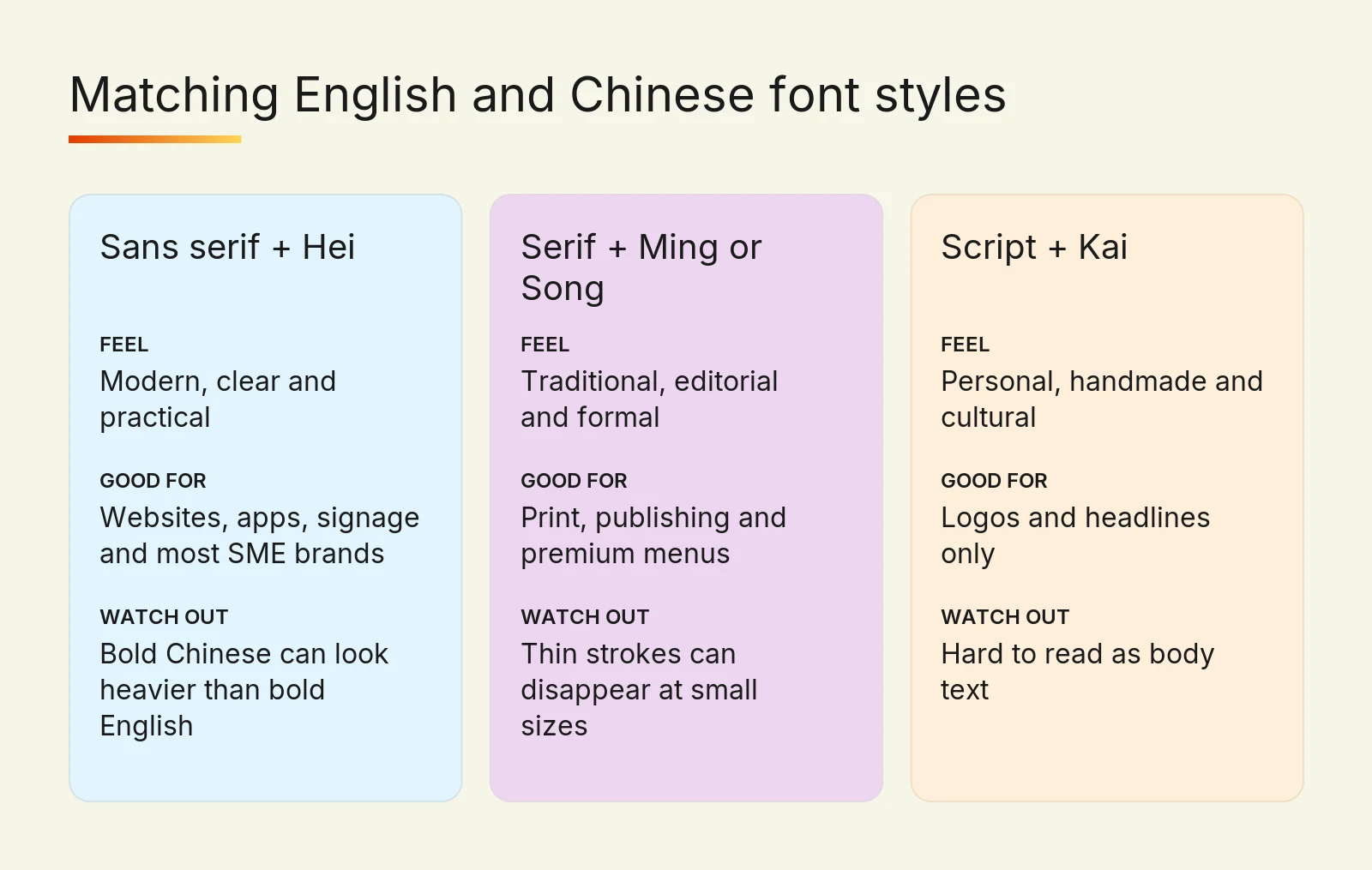
English style | Chinese style | How it feels | Good for |
Sans serif (clean, even strokes) | Hei (黑體), even strokes with no decoration | Modern, clear, practical | Websites, apps, signage, most SME brands |
Serif (thick and thin strokes, small feet) | Ming or Song (明體 / 宋體), thin horizontals and thick verticals | Traditional, editorial, formal | Law, finance-style print, publishing, premium menus |
Script or display | Kai (楷體) or brush styles | Personal, handmade, cultural | Logos and headlines only, never body text |
A sans serif English font with a Ming Chinese font usually looks mismatched, because one has even strokes and the other has strong contrast. Pick the same family in both languages unless a designer has a clear reason to break the rule.
There are far more English fonts than Chinese ones. A complete Traditional Chinese font needs thousands of characters, so fewer families exist, and fewer still come in several weights. In practice, it often saves time to shortlist the Chinese font first and then find an English partner for it.
Five rules for pairing English and Chinese fonts
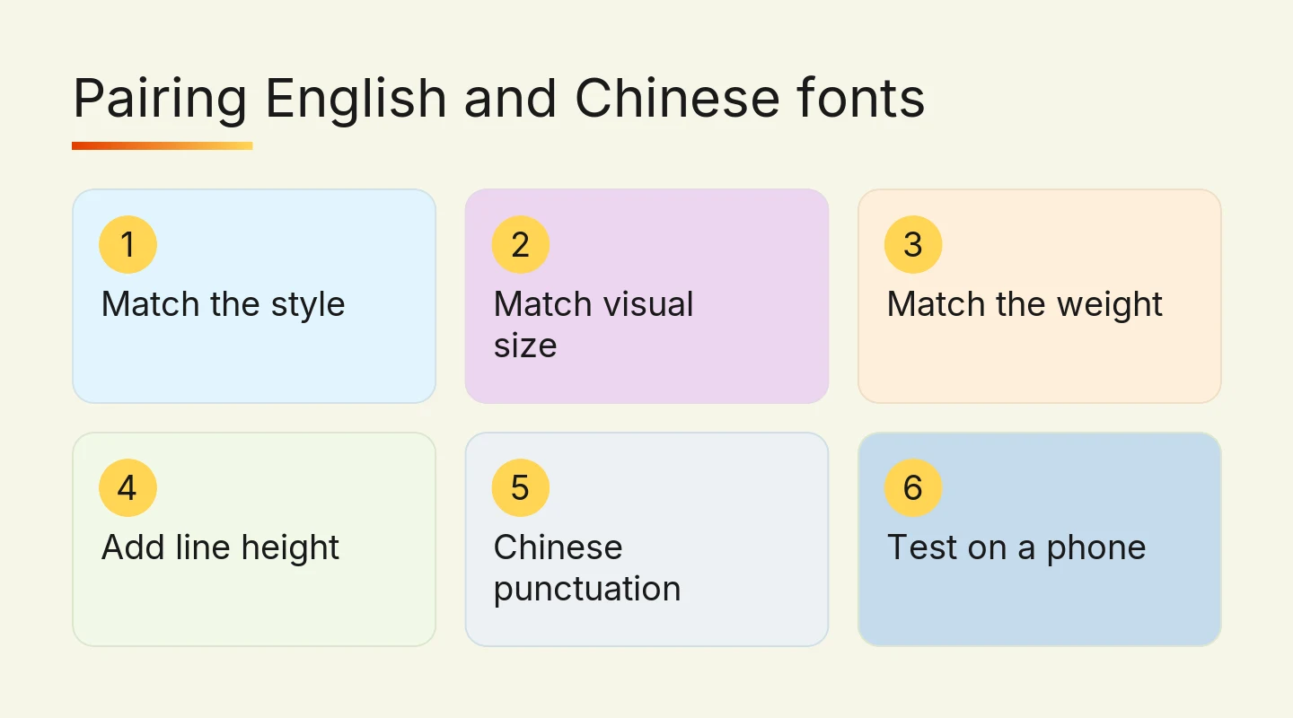
1. Match the visual size, not the point size
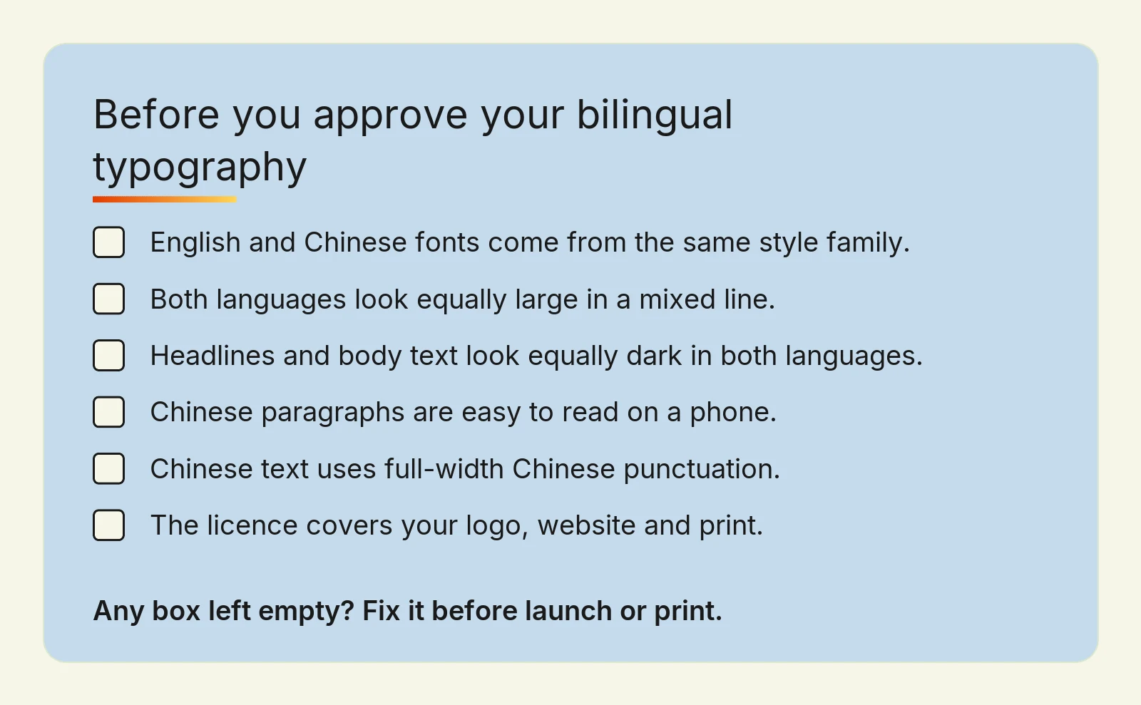
Because Chinese characters fill their square, Chinese text at 16px often looks bigger than English at 16px. Set a line that mixes both languages, then adjust one of them until the English capital letters and the Chinese characters look balanced. On a website this is a single setting your developer can apply to every page.
2. Match the weight
If your English headline is bold, the Chinese headline must be bold too, and the two should look equally dark. Chinese characters have more strokes, so the same nominal weight can look heavier. Check headlines and body text separately, because a pairing that works at one size may not work at another.
3. Give Chinese body text more line height
Dense characters need more space between lines to stay readable, especially on a phone. Start with more line height than you use for English, then read a full paragraph on a small screen. If the lines feel crowded, add space before you reduce the font size.
4. Use Chinese punctuation in Chinese text
Mixing narrow English commas and full stops into Chinese sentences makes the text look careless to Hong Kong readers. Write Chinese copy with full-width punctuation, and keep English punctuation for English copy. When a sentence mixes both, such as a Chinese sentence with an English brand name, the punctuation follows the main language of the sentence.
5. Plan for mixed lines
Hong Kong copy often mixes the two: a Chinese paragraph with an English product name, or an English menu with Chinese dish names. Check that the English font inside Chinese text is your brand font, not a default fallback. Also check that English words do not break in the middle when a Chinese line wraps.
Where bilingual typography matters most
Your logo and Chinese name
A logo with an English name and a Chinese name is called a bilingual lockup. The two names can sit side by side or stacked, and each layout needs its own spacing rules so neither name looks like an afterthought. If you do not yet have a Chinese name, choose it before you design the lockup, because the number of characters changes the layout. We cover why names and logos shape a brand in a separate guide.
A Chinese name is not a translation. It needs to sound right in Cantonese, read well in characters and still look balanced next to your English name.
Your website
On a bilingual website, each language should load its own font. A full Chinese web font file is much larger than an English one, which can slow pages down on mobile. Your developer can reduce this by loading only the characters a page uses (called subsetting) or by using fonts already installed on the visitor's device.
Each language version should also declare its language in the page code, for example Traditional Chinese for Hong Kong, alongside hreflang tags. This helps browsers choose the correct character forms and helps search engines show the right version to the right reader.
Every device also has Chinese fonts built in: iPhones and Macs use PingFang, most Android phones use Noto Sans CJK, and Windows PCs use Microsoft JhengHei. Relying on them is fast, because nothing extra has to download, but each device shows a slightly different design. That is usually fine for body text. For headings and anything that carries your brand, load one web font, such as Noto Sans HK, so every visitor sees the same letters.
Print, signage and social posts
Print shows every flaw, because nobody can zoom in. Ask for a printed proof of anything with small Chinese text, such as name cards, packaging and menus. Thin Ming strokes can disappear at small sizes, so Hei often works better for fine print.
Social posts and WhatsApp images are made quickly by whoever is free that day. This is where most brands drift. A one-page type guide that names your English font, your Chinese font, and the sizes for headlines and body text keeps everyone on the same rules. This kind of consistency across every platform is what makes a small business look established. For Foresight Sports, we carried one identity through the website, social posts and pitch deck, as described in the Foresight Sports project.
Licences and costs to check before you commit
Fonts are software, and each one comes with a licence. A font that is free for personal use may not be free for a logo, a website or an app. Many licences also treat desktop use, web use and app use as separate permissions.
Before you approve a font, ask three questions:
Does the licence cover commercial use, including a logo?
Does it cover web use on your domain, and is there a limit on page views?
Who owns the licence: you or your designer? If your designer leaves, you still need the right to use it.
Some Chinese font families are released under open licences that allow commercial use. Others are sold per user, per website or per year.
Open-licence families include Noto Sans HK, Noto Sans TC and Noto Serif TC from Google, and Source Han Sans and Source Han Serif from Adobe. They are released under the SIL Open Font License, which allows commercial use, including logos and websites, and Noto Sans HK and Noto Sans TC are free on Google Fonts. Commercial Chinese fonts from foundries such as DynaComware or Monotype are usually sold as yearly licences, and web licences are often priced by monthly page views, so ask the foundry for a quote based on your traffic.
Be honest with yourself about scope. If you only need Chinese text on an existing website, you may not need a new identity at all: a well-chosen open-licence font and the five rules above may be enough. A full bilingual system makes sense when you are launching, rebranding, or entering the Hong Kong market and need a Chinese name, a bilingual logo and guidelines your team can follow. At Digital Nova, logo work starts from HK$8,000, a full identity from HK$20,000 and a complete bilingual system from HK$35,000, with a timeline of 3–8 weeks.
Frequently asked questions
What Chinese font goes well with an English sans serif font?
A Hei (黑體) style Chinese font is the natural partner for an English sans serif font, because both use even strokes with no decoration. Choose a Hei family that comes in the same weights you use in English, such as regular and bold. Then adjust the sizes so both scripts look equally large and dark in a mixed line.
Why does Chinese text look bigger than English at the same font size?
Chinese text looks bigger because every character fills a full square, while most English letters use only part of the line height. Chinese characters also have more strokes, so they look darker. To balance a bilingual layout, match the visual size of the two scripts by eye rather than using the same number for both.
Can I use any Chinese font I find for my business?
No, a Chinese font needs a licence that covers commercial use. Free for personal use does not mean free for a logo, a website or an app, and many licences treat these as separate permissions. Check the licence terms before you approve a design, and make sure your business, not only your designer, holds the right to use the font.
Should my Chinese brand name use the same style as my English logo?
Yes, in most cases the Chinese name should use the same style family as the English name, so a sans serif English logo pairs with a Hei Chinese name. The two names should also look equally heavy and sit on a shared layout. A calligraphy or brush style can work for the Chinese name only when that contrast is a deliberate part of the brand.
How much does a bilingual brand identity cost in Hong Kong?
At Digital Nova, a complete bilingual brand system starts from HK$35,000, a full identity from HK$20,000 and logo work from HK$8,000, with a timeline of 3–8 weeks. The right level depends on whether you need a Chinese name, a bilingual logo lockup and written guidelines, or only a font pairing for an existing brand.
Make your English and Chinese brand look like one company
Start today with a simple test. Put your English logo, your Chinese name and one paragraph of each language on a single page, view it on a phone, and print it. If the two languages look like different companies, the five rules above show you where to start.
If you would rather have it done properly, Digital Nova designs a complete bilingual brand identity, including Chinese naming, bilingual logo lockups and typography guidelines across English and Traditional Chinese. We can run the project in Cantonese or English. Tell us about your brand and we will suggest the smallest scope that solves the problem.